

The companion banner beside a YouTube pre-roll is not a smaller version of your video—it is a second audition in a different grammar. At 2:14 p.m., a performance designer has Figma open on a 300×60 frame, a brand guidelines PDF locked at 2019, and a media buyer asking for "something clickable" without specifying whether the click should drive streams, ticket sales, or email capture. That gap is where high CTR YouTube ad companion banners are won or lost: not in bid modifiers, but in whether a sixty-pixel-tall strip can survive muted autoplay, dark-mode chrome, and a viewer thumb already hovering toward skip.
This article is a visual craft playbook for label art directors, agency designers, and in-house growth teams building companion display units for YouTube Ads. You will not find geo bid tables or funnel architecture here—those belong in media-buying lanes. Instead: size systems, layout grids, contrast rules, CTA copy discipline, brand lockup constraints, A/B testing protocols, and a design-rule table mapping craft decisions to CTR impact hypotheses. Julian Cole's lens treats the companion banner as a parallel creative surface synchronized with the video hook, not an afterthought exported from the key art.
Companion banners earn clicks in pixels, not minutes—layout and contrast decide whether the video hook gets a second conversion path.
Companion Banner Size System
YouTube companion display inventory clusters around a handful of IAB footprints. Treat them as a size system, not interchangeable exports. Each dimension imposes a different reading order and a different tolerance for copy.
300×60 Leaderboard (Desktop Companion)
The classic desktop companion sits beside in-stream video at 300 pixels wide by 60 pixels tall. You have roughly one headline line, one CTA chip, and a logo mark—no paragraph, no subhead unless you sacrifice legibility. Design for scan at arm's length on a 24-inch monitor. Assume the banner shares visual attention with a playing video; motion on screen competes with your static frame.
300×250 Medium Rectangle
Some placements and reservation-style buys expose a medium rectangle with more vertical real estate. Here you can run headline plus supporting line plus CTA, but resist the urge to fill every pixel. Negative space signals confidence; clutter signals desperation. The 300×250 is where product stills and artist photography can breathe—if cropped with a single focal point.
File Weight and Format
Prefer static JPG or PNG under 150 KB; reserve animation for brand-critical loops only. Export logos @2x or as SVG; rasterize photography at twice display size for retina legibility. Per IAB display creative guidance, a companion that loads late never earns a click.
Banner Anatomy Wireframe
Before debating gradient trends, lock anatomical zones. Every size variant should map to the same semantic regions so A/B tests isolate variables instead of reinventing layout per export.
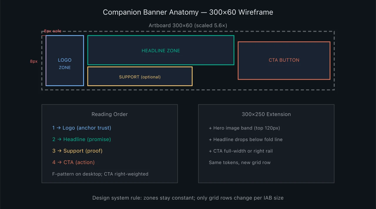
Companion banner anatomy wireframe — 300×60
The wireframe encodes a non-negotiable rule: logo left, CTA right, headline occupying the cognitive center. Swapping CTA to left may win in isolated tests for RTL markets, but default LTR campaigns should start with F-pattern alignment before experimental mirroring.
Layout Grid and Alignment
Companion banners fail when art directors eyeball alignment per export. Build an eight-pixel baseline grid on 300×60 and a twelve-pixel grid on 300×250. Snap logo clearspace, CTA padding, and cap-height to grid lines so multi-campaign batches look authored by one system.
Sync With Video Hook
On 300×60, divide width into twelve columns: logo 1–3, headline 4–9, CTA 10–12. Optical vertical centering beats math on 60 px height—nudge headlines one to two pixels up if they feel sunken. Layout must echo the video's first-frame promise. Julian Cole's companion rule: one objective per surface—video sells the emotional hook; banner sells the single next click.
Contrast and Legibility System
CTR dies in low-contrast greige. YouTube's player chrome shifts between dark and light contexts; companions often sit on mid-tone backgrounds. Design for worst-case contrast, not brand-guide pastels on white.
WCAG Minimums in Practice
Target WCAG AA contrast ratios (4.5:1 for body text, 3:1 for large bold headlines) as a floor—not a ceiling. Run headlines and CTA labels through a contrast checker against both #0f0f0f and #f1f1f1 simulated backgrounds. If brand purple fails on dark, introduce a high-contrast CTA fill (white on purple, or amber on charcoal) rather than compromising headline hue.
Color Token Library
Publish tokens: banner-bg-primary, banner-text-high, banner-cta-fill. Limit to two hues plus neutral per variant. Preview on #0f0f0f player chrome—not white artboards—since dark mode is the default for many viewers. Photography underlays need directional scrims at sixty to seventy percent opacity, not full-frame darkening.
CTA Copy Discipline
The CTA is three to five words carrying the entire conversion burden. Generic "Learn More" underperforms specific verbs tied to the landing experience—consistently in display CTR literature and in internal music-campaign retrospectives.
Verb-First Formulas
Stream: "Listen Now," "Play the Single," "Hear It First." Tickets: "Get Tickets," "Grab Seats," "Book the Show." Email: "Join the List," "Get Early Access." Merch: "Shop the Drop," "Cop the Tee." Match verb to landing page action—misaligned CTAs raise clicks but crater landing conversion, poisoning optimization loops.
Character Count Limits
On 300×60, cap CTA labels at eighteen characters including spaces. Longer strings force fontSize reduction, which hurts legibility more than a shorter synonym would. Use "Pre-Save" over "Pre-Save Now on Spotify" in the leaderboard; save platform specificity for the landing page.
Urgency Without Spam
"Tonight Only" and "Last Chance" lift CTR short-term but fatigue fast under frequency. Rotate urgency CTAs only during the final forty-eight hours of a ticket onsale. Evergreen stream campaigns should prefer timeless verbs—"Listen Now" ages better than "Don't Miss Out."
Brand Lockup Constraints
Artist logos arrive in conflicting formats: raster wordmarks, circular avatars, horizontal lockups with taglines. The companion banner is not a poster—lockup discipline prevents illegible micro-shrinks.
Minimum Clearspace
Define minimum logo width as twenty percent of banner width on 300×60 (sixty px max width) and cap height at eighty percent of banner height (forty-eight px). Below those thresholds, switch to avatar monogram or initials badge approved in the brand system.
Co-Branding and Tour Sponsors
Artist logo primary; sponsor at fifty percent area or in the support zone. When bitmap logos fail at small size, set the artist name in the official display typeface—document the fallback in the design system.
Design Rule → CTR Impact Hypothesis
CTR movement is placement- and audience-dependent; treat the table as test hypotheses, not guarantees. Log your own results per genre and objective.
| Design Rule | Implementation | CTR Impact Hypothesis | Confidence Band |
|---|---|---|---|
| High-contrast CTA fill | WCAG AA+ button color isolated from background | +0.15% to +0.45% absolute CTR | High |
| Verb-specific CTA | "Listen Now" vs "Learn More" | +0.10% to +0.35% absolute CTR | High |
| Logo left, CTA right | F-pattern grid on 300×60 | +0.05% to +0.20% absolute CTR | Medium |
| Headline ≤ 28 characters | Single-line promise, no ellipsis | +0.08% to +0.22% absolute CTR | Medium |
| Photography with directional scrim | Left scrim 60% opacity under text | +0.04% to +0.18% absolute CTR | Medium |
| Video-hook headline match | Same lyric/tour/date as pre-roll hook | +0.12% to +0.30% absolute CTR | High |
| Animated GIF hero | Subtle 2–3 frame loop under 40 KB | −0.05% to +0.15% absolute CTR | Low |
| Dual-logo co-brand | Equal-size artist + sponsor marks | −0.10% to −0.25% absolute CTR | Medium |
| Pastel text on photo | No scrim, brand mint on busy image | −0.15% to −0.40% absolute CTR | High |
| Urgency CTA week one | "Last Chance" on evergreen stream push | −0.08% to −0.20% after day three | Medium |
| @2x raster export | Crisp logo edges on retina displays | +0.03% to +0.10% absolute CTR | Low |
| 300×250 image band | Face-forward crop, eyes in upper third | +0.20% to +0.55% vs 300×60 alone | Medium |
Absolute CTR deltas look small on paper—a move from 0.40% to 0.65% is a sixty-two percent relative lift. On a million impressions, that is 2,500 extra clicks from craft alone, before video optimization enters the conversation.
Building a Companion Design System
A design system turns one-off banners into a repeatable factory. Document these artifacts in Figma (or equivalent) and link them from every campaign brief.
Master Components
Create components for each IAB size with variant properties: objective (stream / tickets / email), theme (dark / light), CTA set, logo type (horizontal / avatar / type-only). Producers swap variants; they do not redraw grids.
Template Versioning
Semantic version templates: v1.2 adds a festival co-brand slot. Media buyers reference template IDs in ad names so reporting ties CTR to layout generation. "Companion_v1.2_stream_dark_listen-now" beats "banner_final_3.jpg."
Headline Copy Rules
Headlines carry promise; support lines carry proof—on 300×250 only, and only with concrete proof ("New Single Out Friday," "Featuring [Name]"). Complement the video title, never duplicate it. Sentence case beats all-caps at small sizes; avoid script fonts under 14 px equivalent.
Handoff Spec Sheet
Export pixel dimensions, file-weight caps, font sizes, hex values, and CTA limits. Deliver numbered files with UTM-mapped click URLs; confirm companion pairing matches the video ad group. Request size-segmented CTR reports so 300×250 and 300×60 learnings stay separate.
A/B Testing Companion Creatives
Test creative variables with the same discipline media buyers apply to video hooks—but isolate one design lever per cell.
What to Test First
Phase one: CTA verb specificity (Listen Now vs Play Single). Phase two: headline promise (release date vs emotional hook). Phase three: contrast mode (dark vs light theme). Phase four: photography vs solid brand field. Do not rotate all four simultaneously; you will not know what moved CTR.
Winner Promotion Rules
Run seven to fourteen days or three thousand impressions per cell. Name assets Artist_Campaign_Companion_300x60_CTA-ListenNow_Dark_vA so trafficking errors do not duplicate controls. Promote when CTR beats control by ≥ fifteen percent relative for two consecutive three-day periods and landing conversion holds within five percent.
Case Study: Indie Single Launch
An indie label ran a fourteen-day pre-save campaign with a default Canva-export companion: low-contrast lavender CTA, "Learn More," full tour-poster crop shrunk to 300×60. CTR sat at 0.31% on 420,000 impressions.
Redesign applied the anatomy wireframe: avatar logo left, eighteen-character headline "New Single Friday," verb CTA "Pre-Save Now" on amber fill, dark scrim field. CTR rose to 0.58% on the next 380,000 impressions with the same video and audiences—only the companion changed. Relative lift: eighty-seven percent. The lesson is layout and CTA craft, not budget scale.
FAQ: High CTR YouTube Ad Companion Banners
What is the best companion banner size for music campaigns?
300×60 is the workhorse for desktop in-stream companions; build it first. Add 300×250 when placements and budgets allow richer storytelling. Cover both in your design system so trafficking never improvises.
How much text fits on a 300×60 banner?
One headline line of roughly twenty-two to twenty-eight characters and a CTA of three to five words. Support copy is optional and usually costs legibility—reserve it for 300×250.
What CTR should I expect from companion banners?
Display CTR varies wildly by vertical and placement. Music prospecting often lands 0.25%–0.70% on well-crafted companions; below 0.20% after sufficient impressions usually signals design or pairing failure, not audience fatigue alone.
Should the companion match the video thumbnail?
Align mood and color grade, not necessarily duplicate the thumbnail. Visual continuity lifts CTR; pixel-identical duplication can increase banner blindness. Echo the hook, vary the layout.
Static vs animated companions—which wins?
Static wins more often when animation adds file weight without new information. Subtle two-frame loops can lift CTR for fashion-forward brands; test against a crisp static control.
How often should I refresh companion creative?
Every two to three weeks on sustained flights, or at each campaign phase change (teaser → release → last-chance tickets). Refresh layout or CTA before frequency caps force the same viewer to stare at tired creative.
What belongs in a starter design system doc?
Size matrix, anatomy wireframe, grid specs, color tokens, typography scale, logo minimums, CTA verb library, export settings, naming convention, and A/B test log template. Seven pages beats seventy slides.
High CTR YouTube Ad Companion Banners Summary
Design high CTR YouTube ad companion banners by treating 300×60 and 300×250 units as a size system with fixed anatomy: logo anchor left, headline promise center, verb-first CTA right, contrast engineered for dark player chrome, and brand lockups governed by minimum clearspace—not poster shrink. Build a versioned design system, map craft rules to CTR hypotheses, pair banners deliberately with video hooks, and A/B test one lever per cell with disciplined naming. Companion banners are parallel conversion surfaces; visual craft is the operational edge when media buying is already competent.


